My youngest rejected the movie poster look
I wanted a header, but got greedy over the card buttons instead
My family was chatting about how important design is, and the conversation drifted to the Soosooland platform. My youngest told me to add a header to Soosooland. As an example, she showed me a site with a toggle button and menu at the top of the screen — the kind of header that's always visible on every page, like Google's.So I thought about adding a header to Soosooland too. A toggle button along with it seemed like it would be perfect. But once I actually looked, every game had a different screen size and background color. The toggle button IDs were all different too. The index page had a toggle, but some game files had one and single-language game files had none at all.
On top of that, the header color might clash with each game's background, and if I wanted a game to run fullscreen, having the header take up space at the top would feel cramped. In the end, adding a header to Soosooland just wasn't feasible. It's only possible when every page shares the same style — and since I'd built each game independently, there was no unified style to begin with.
Still, while going back and forth on the header idea and browsing various game platforms, I got greedy about a different thing: making Soosooland's card buttons prettier. I figured if I made them a 2:1 ratio, they'd double as perfect Twitter share images later.
"Make the ratio 2:1." I wrote that down neatly in my journal before bed — and forgot it completely the moment I woke up. That morning, while watching a weekend drama on Netflix, I suddenly started working in a 2:3 movie-poster ratio instead.
The movie poster style — pretty cool, actually?
I cropped a few images saved on my iPad and dropped them into Soosooland, and also asked ChatGPT to draw some for me. Once I did this, the badge that used to sit on top of the old buttons no longer fit, so I moved it to the bottom. When I redrew the images for "NumNum" and "NumStone," there was zero visual consistency. With old and new designs jumbled together, the Soosooland platform started to look like a demolition zone mid-redevelopment.
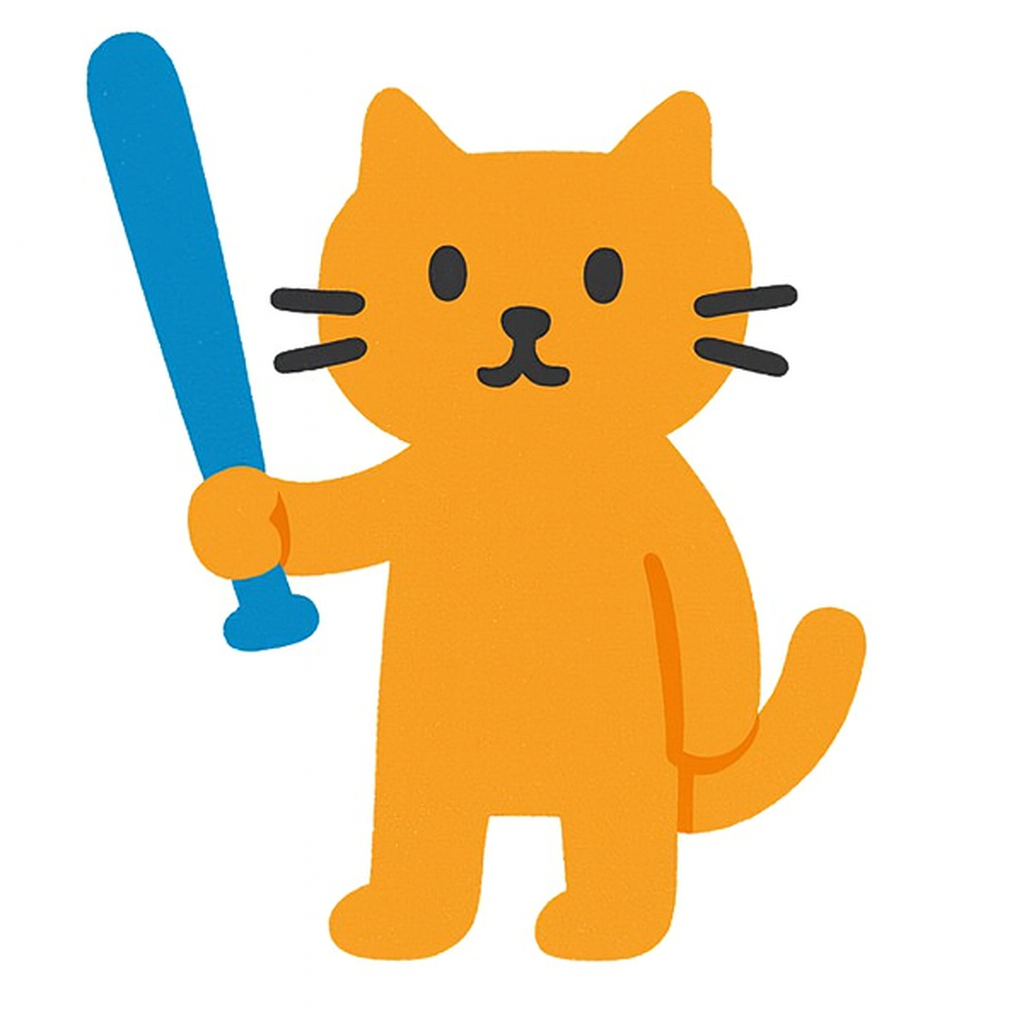
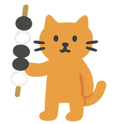
ChatGPT was still in the middle of drawing the NumStone series — each piece looked good on its own, but aside from the cat character, there was no overall unity. The Trinkle series was the same story: Gemini drew Trinkle while ChatGPT drew Tritera, so they ended up looking like two completely different games. To make matters worse, the "Worpuzz Breeze Line" that Gemini drew came out photorealistic, so it stood out on its own too.
Since I already had 3 images done, I figured drawing 3 more in a similar feel would be enough. I asked ChatGPT for 3 more, requesting the exact same font and font size for consistency. But the finished font and letter-spacing were subtly different from the sample I'd sent as reference.
I realized I couldn't just keep winging it — I needed to nail down a concept first. Like how beer cans on a store shelf all have different designs, but lined up together they look colorful and appealing.
1. Netflix movie poster style
2. Simplified colors and simple illustrations, beer-can style
3. Completely different aspect ratio — go for a U.S. license-plate style
Both Gemini and ChatGPT said option 2 was best. So I started by drawing one myself to show them. It was a mess since it was my first attempt, but my daughter encouraged me: "Not bad, just use it!" I could manage the drawing part somehow, but whenever I added handwritten lettering, it kept coming out crooked.
In the end, I asked Claude to write a program that would cleanly overlay text on top of images. Once I layered fonts over my drawings this way, it looked passable enough — but realizing I still had 31 more cards to draw felt overwhelming and daunting.
I wrote the game name over a photo of an open-pit mine
I'd also been unhappy with the mismatched fonts across the NumStone series, so I used this same program to clean up and unify the title fonts there too. You should be able to tell what the game is just by looking at the picture.

My youngest said one thing that hit hard:
"You should be able to tell instantly what the game is just from the picture. The movie poster style doesn't work!"
I was crushed for a moment.
*We don't know the plot before we watch a movie — so why can't games work the same way?*
But she had a point.
Except for Omok, every game name is unfamiliar, so the image has to communicate what the game actually is.
In the end, I restored the design to how it looked in early July — cards with a one-line description on each button. Then I carefully fine-tuned the badge position, line spacing, and emoji placement, nudging things pixel by pixel.
Any users who visited Soosooland over the past three days, while it looked like a demolition zone, must have been pretty confused. But I did learn something: until a design is fully finished, I shouldn't push it to the live server so carelessly.
After restoring everything, I moved on to a new game I'm starting to build called "Wordmine." I still need to do the meta tag work for Moeum Quiz, Worpuzz, and Trinkle, but that's gotten pushed back. I keep getting the urge to make Soosooland even prettier, but for now, I need to hold back.

🪄 Written by Soosoo, translated by Claude
댓글